Are you up for the challenge to introduce contemporary & modern design aesthetics in your home?
One of the best parts of interior design is the wealth of furniture available from centuries of human design aesthetics from
old to
new styles that can resemble its own unique personality and viewpoint. Traditional design elements can be valuable not only for their classical appearance, but also for the history and the memories. It is possible to have your home feel elaborate, romantic, elegant and modern.
This design is a perfect example of the blending of two separate decorative styles from seperate centuries. For example, the striking walls are reminiscent of eighteen century with its high ceilings, plastered walls and ornate carvings. The furniture is modern, and includes pieces by
Studio Roche Bobois leather hide from the
Cinephile sofas (Collection Particulière) directly opposes the romantic and grandiose setting. Sleek side table pieces and smooth accessories are used throughout the room, which are in contrast with the traditional carved and gilded motifs in low relief on the wall. A pure white and dark brown palette with silver accents stands out against the soft pale colours of the wood and plaster surrounding it. The result is a look that transcends centuries and challenges our perception of contemporary vs traditional.
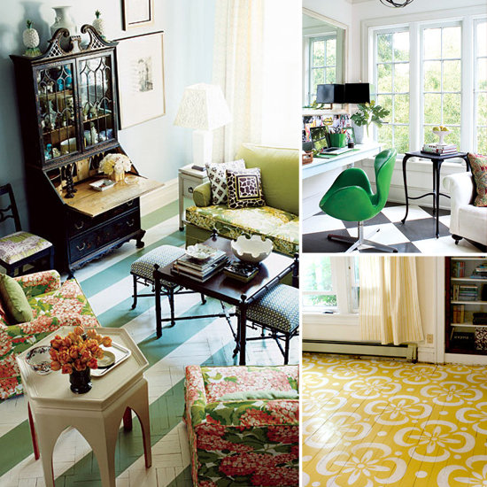
You can also work with fabrics that can look great with both contemporary and traditional environments and may have a very old-world quality.


 Color Scheme
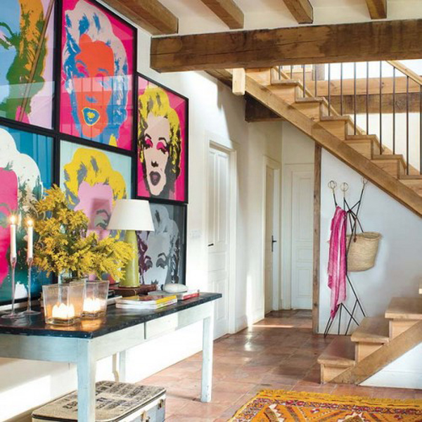
The color scheme in pop art is bright and clashing. Choose
two bright contrasting colors and a neutral to balance them out. Color blocks
can also be used in furniture together with some prints and patterns.
Color Scheme
The color scheme in pop art is bright and clashing. Choose
two bright contrasting colors and a neutral to balance them out. Color blocks
can also be used in furniture together with some prints and patterns.